← All guides
📊
InsightsSee exactly where your money goes
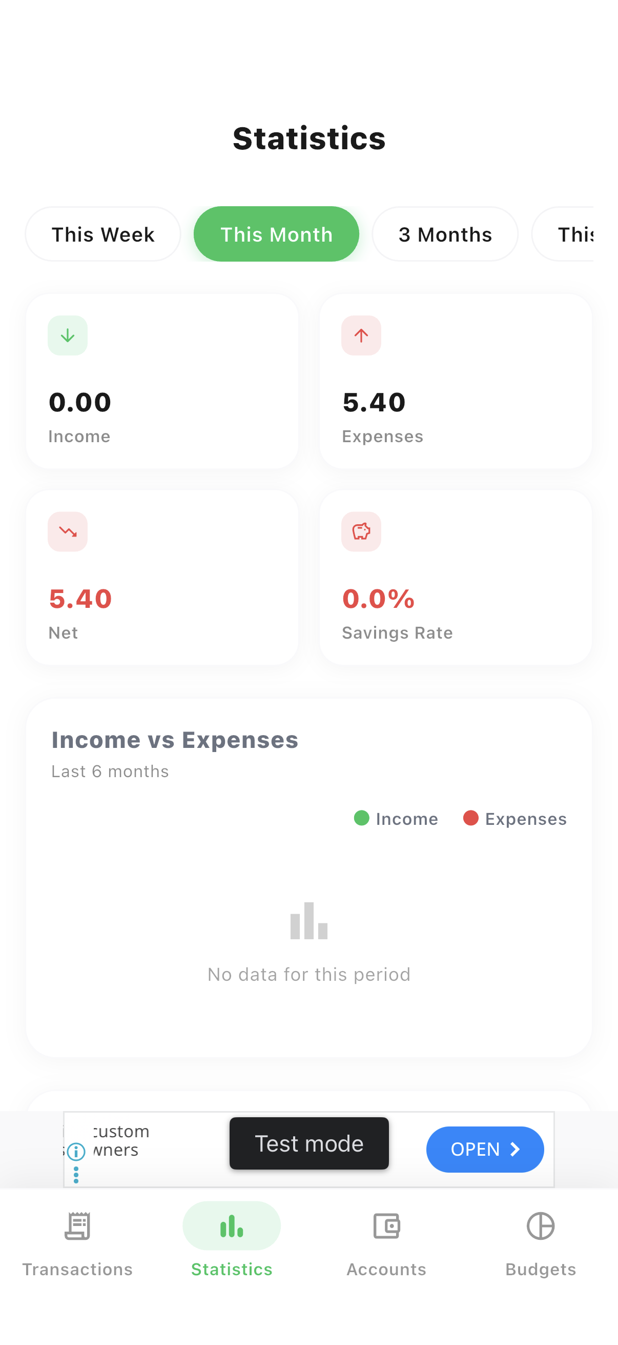
Statistics turns your transaction history into charts: category breakdowns, a six-month income-vs-expense trend, a savings-rate card, and a day-of-week spending pattern.
Guide 3 of 11
Overview
Income, expenses, net & savings rate
Summary cards up top, then a six-month trend line, a category breakdown, and a day-of-week spending pattern underneath.
- 1Open the Statistics tab from the bottom navigation.
- 2Review the Income, Expenses, Net and Savings Rate summary cards.
- 3Scroll to see the trend line, category pie chart, and weekly spending pattern.
Period
Zoom out with different time ranges
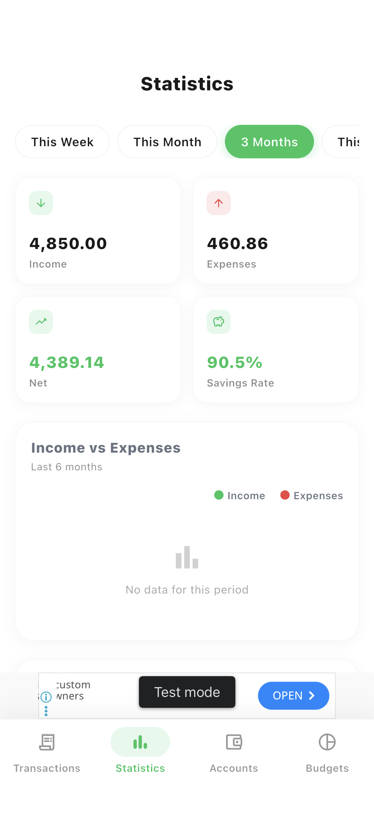
Every chart on the page recalculates instantly for the period you pick.
- 1Tap This Week, This Month, 3 Months or This Year at the top to change the whole page at once.
Ready to try it yourself?
Spencio is free to download on iOS and Android — every feature in this guide is included.